As a designer on the Xbox team, I create content across editorial surfaces and collaborate closely with global marketing teams to support key business and brand initiatives. My work spans a wide range of tasks, including: Marketing design, game promotion, new member acquisition, seasonal campaigns, content refreshes, membership benefits promotion, content testing, hero prompts, multi-slot takeovers, internal badges and recognition assets.
I’ve produced high-impact visual assets including custom illustrations and iconography for global marketing campaigns that enhance the visibility and appeal of Xbox products. In a fast-paced, high-volume environment, I consistently deliver high-quality, scalable visuals across various platforms and asset sizes.
My contributions help drive engagement, increase brand reach, and align creative execution with strategic marketing goals all while reaching millions of gamers worldwide.

Quests Icon
I created the new icon for the redesigned Xbox Game Pass Quests, part of a larger refresh of the Rewards program. With more ways to earn points on both console and PC, and weekly rewards for players 18+, the update reflects Xbox’s focus on making gameplay rewarding, fun, and age-appropriate.
The icon draws from the idea of a treasure map, a fitting symbol for the player’s journey of exploring, completing challenges, and collecting points along the way.

Takeovers
I served as the lead designer on several high-impact Xbox Takeovers, major marketing campaigns centered around the launch of highly anticipated titles. These campaigns are comprehensive and fast-paced, involving a wide range of assets across digital and physical channels. From concept to execution, I collaborated closely with cross-functional teams and stakeholders to ensure cohesive, visually compelling experiences that captured the excitement of each game release.

Internal Commemorative Badge
I designed a ship it badge for Project Phoenix. It was one of the major product launches in 2024 and this was made to recognize the contributions of the team working on it.
Overview
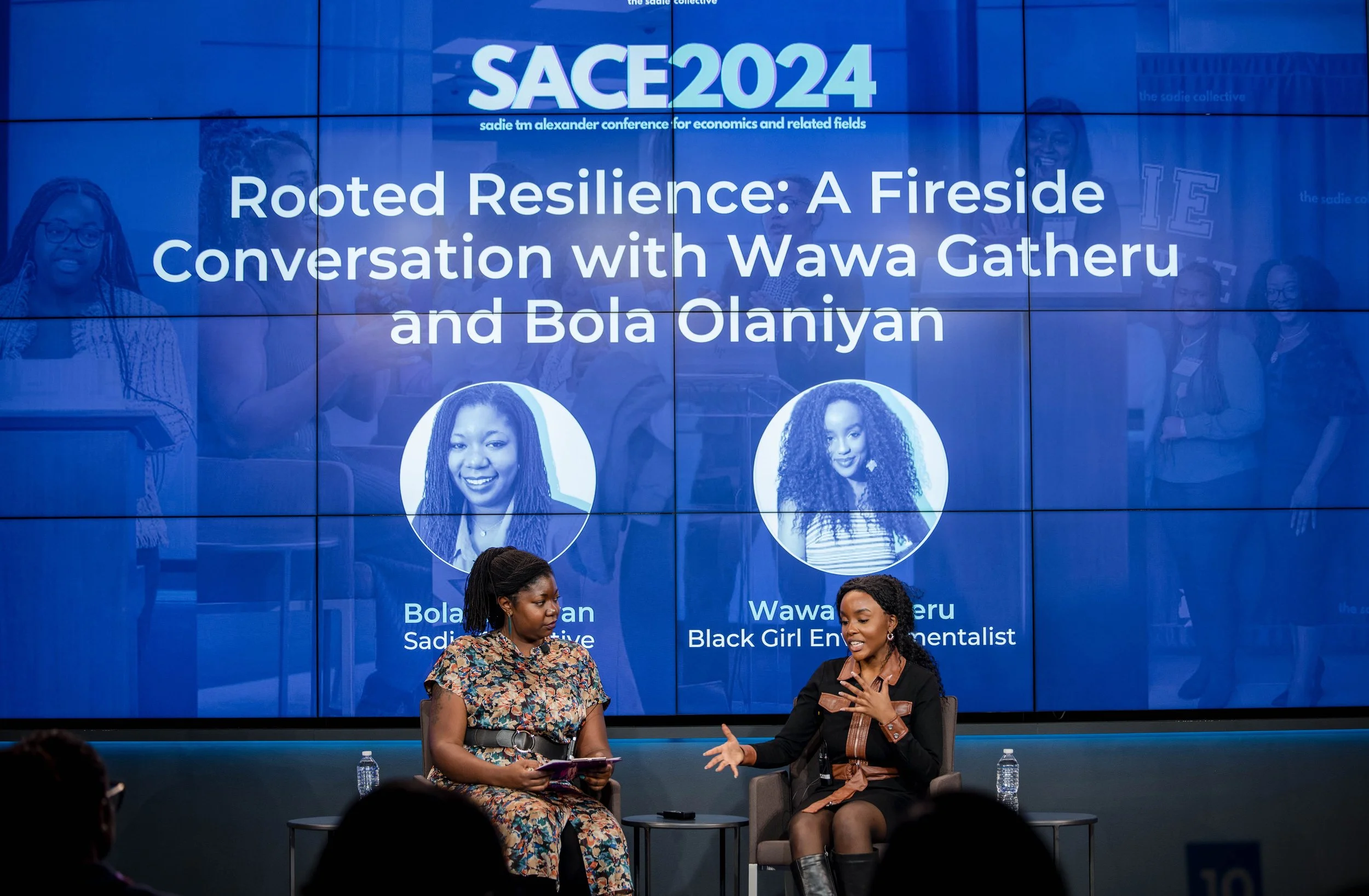
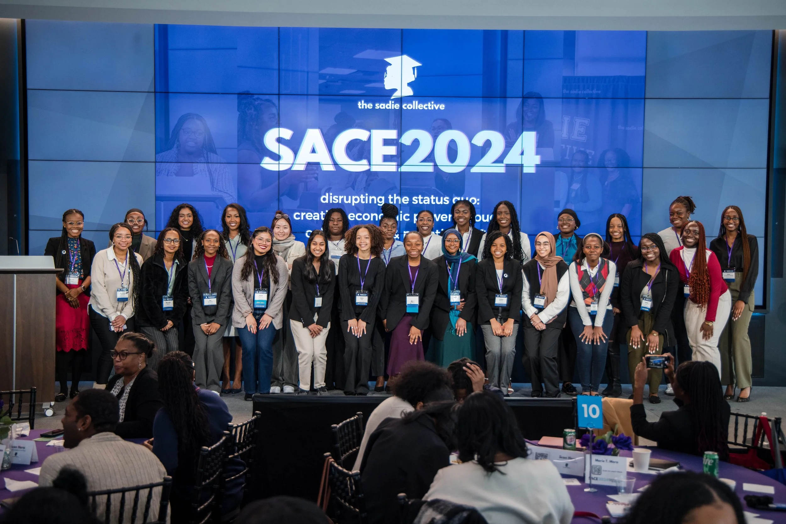
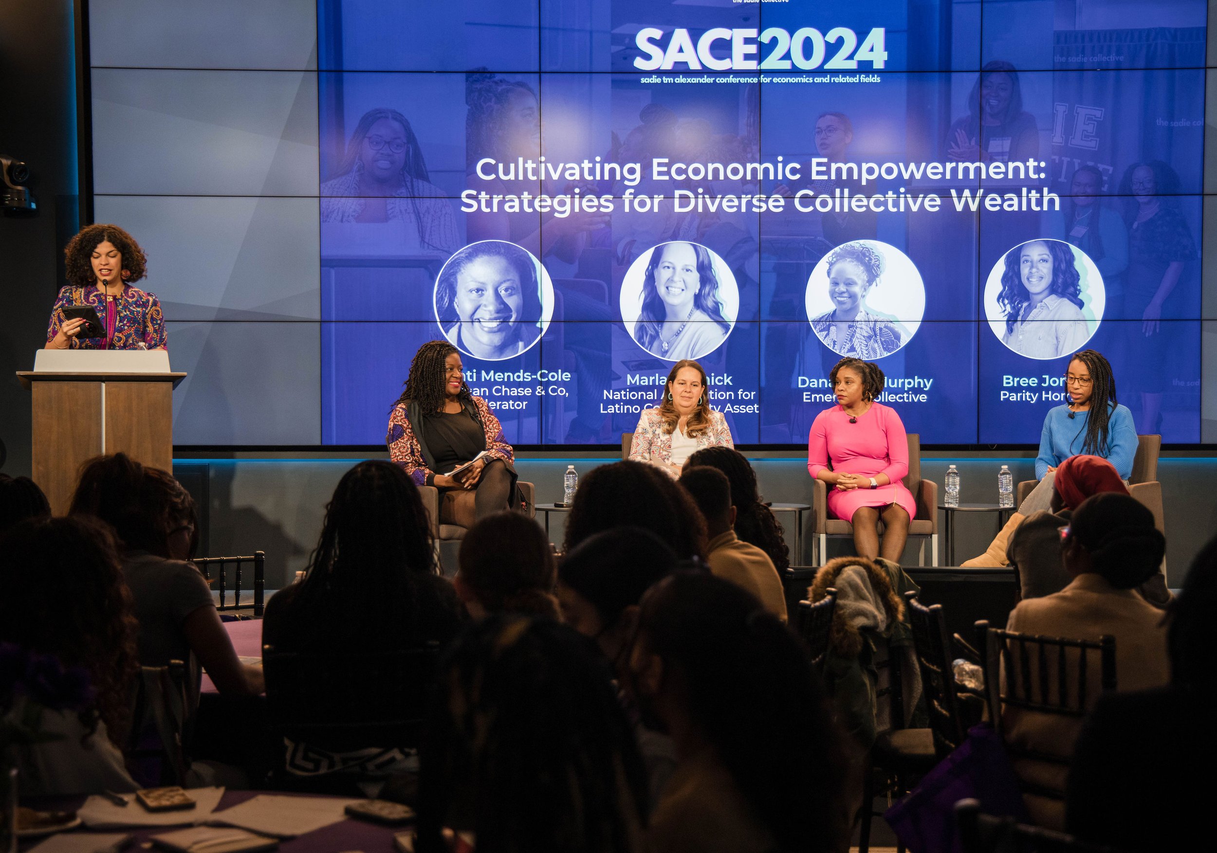
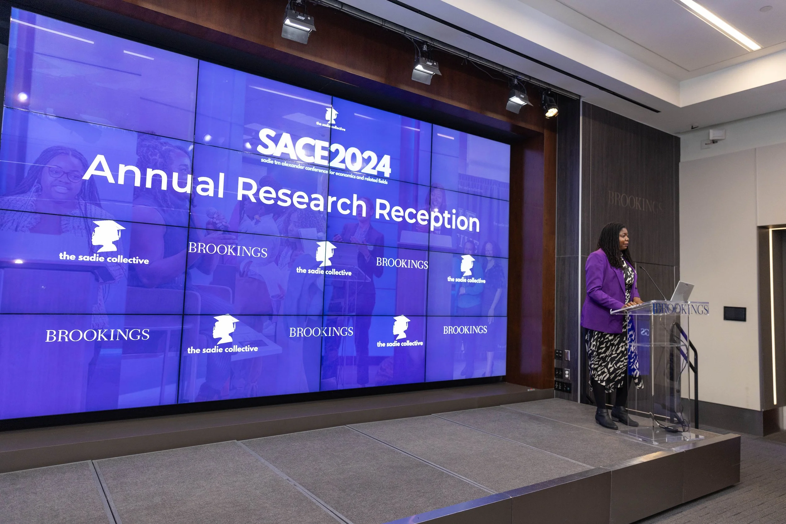
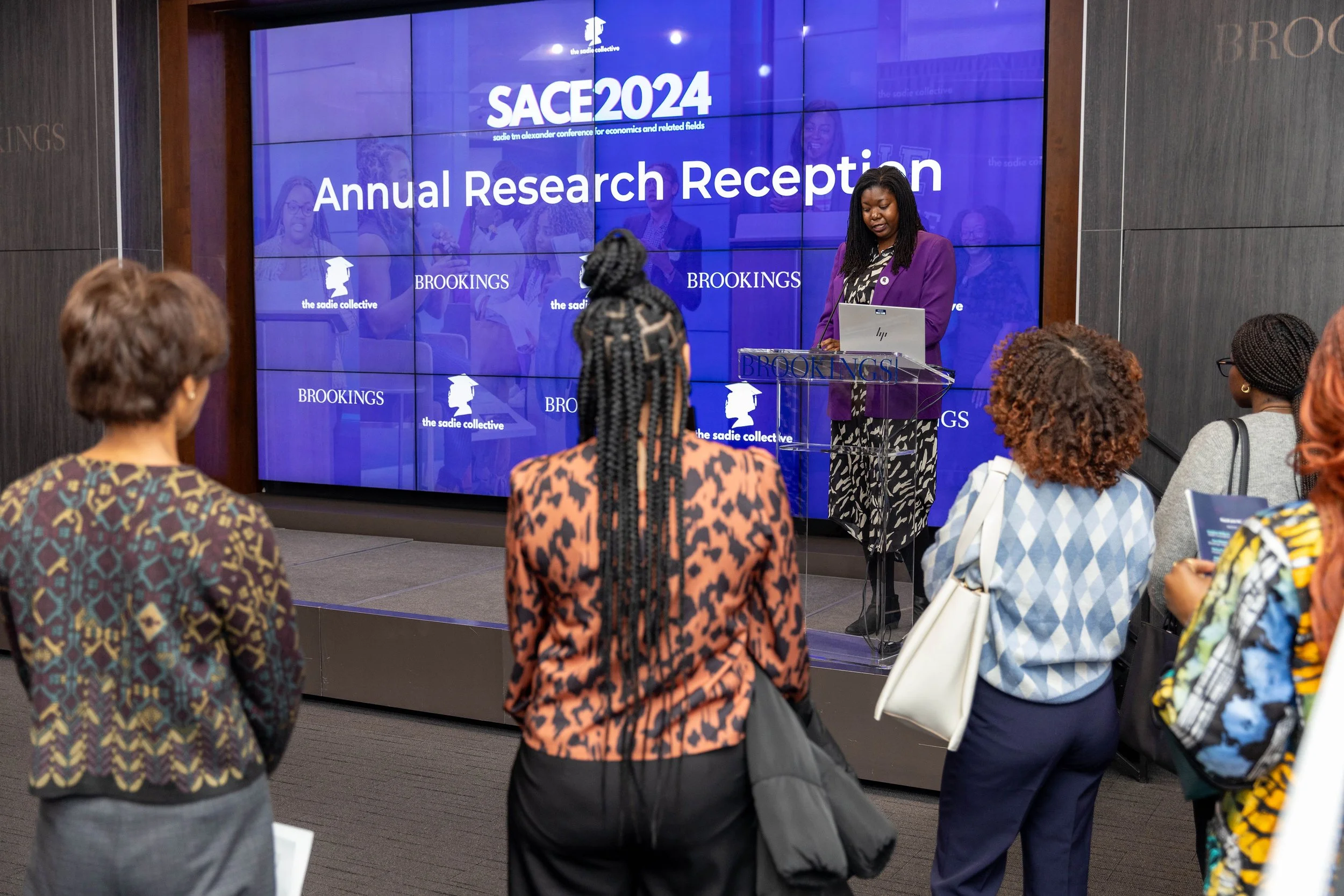
While at The Sadie Collective, I served as the lead designer for the 6th Annual Sadie T.M. Alexander Conference for Economics and Related Fields, held at the Brookings Institution, the Urban Institute, and at the White House in Washington, D.C. With a tight two-week turnaround, I developed a full suite of branded assets for this sold-out event, which welcomed over 300 attendees from 60+ institutions.
The conference featured a distinguished lineup of speakers, including Thasunda Brown Duckett (CEO, TIAA), Dr. Helene Gayle (President, Spelman College), and Wawa Gatheru (Founder, Black Girl Environmentalist), among 30+ other influential voices.
Conference deliverables included:
PowerPoint presentations
Printed agenda and reception program
Posters and brochures
Branded social media graphics and digital promotions
In addition to the conference, I also designed a range of standalone assets for the broader organization, including:
Logos and graphic templates
Annual report layout
Conference photography by Annan Productions LLC

SACE 2025 Logo
Logo for the 2025 conference in Washington D.C. I was inspired by camp badges.

Explorations
I explored a few concepts before the team and I landed on the final version. I drew inspiration from nature and the city's architecture, aiming for a look that feels youthful and playful.

2023 Annual Report
I approached the design of their 2023 Annual Report with the aim of capturing the boldness, energy, and forward-thinking nature of their mission. Take a look at the PDF here.

2024 Annual Report
For this report, I drew inspiration from the vibrant energy of the conference I was fortunate to attend that year. My goal was to create something that conveyed movement and dynamism while remaining professional. This project was assigned toward the end of my contract, so after my departure, the intern continued some of the work. Take a look at the PDF here.


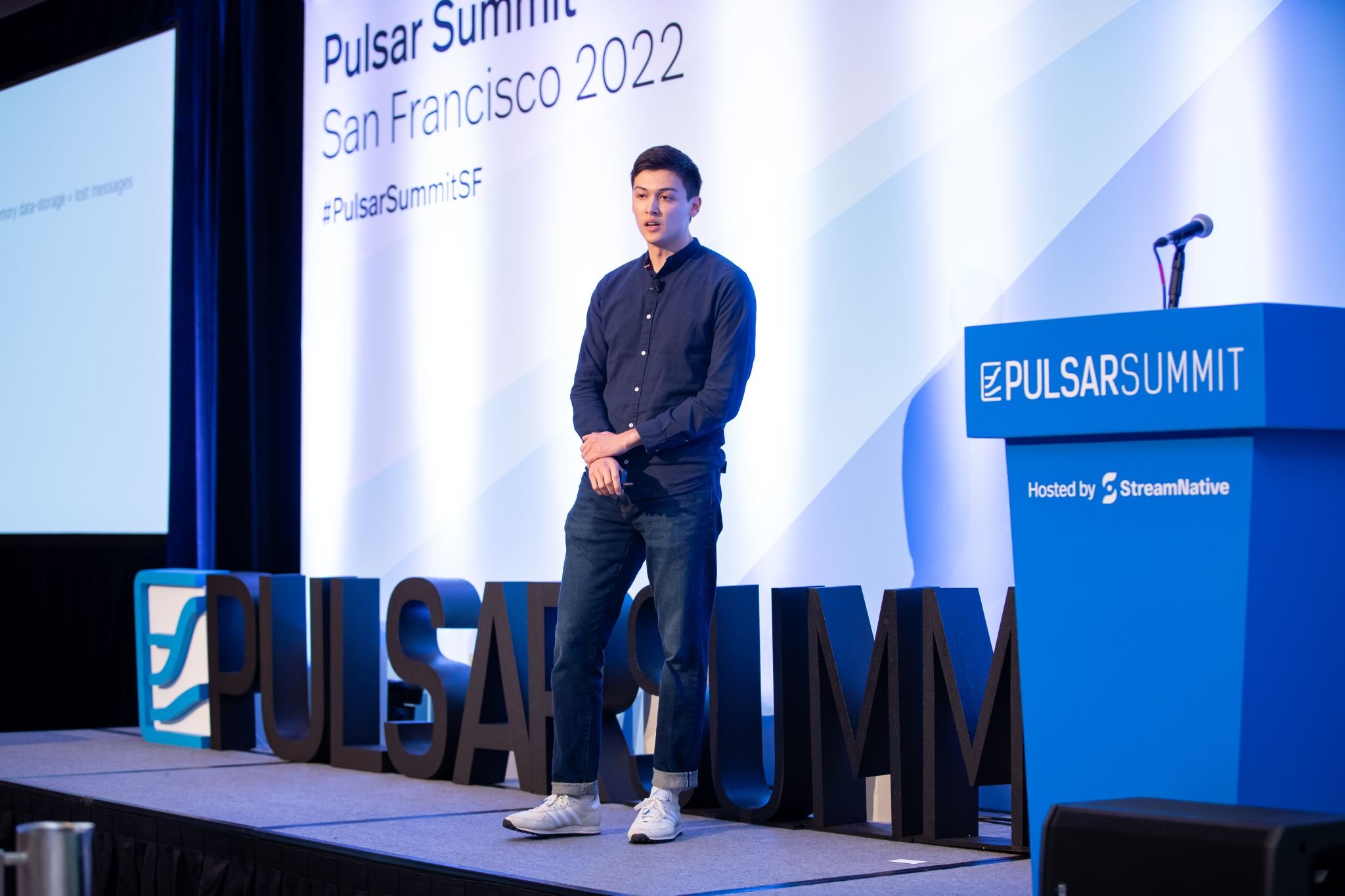
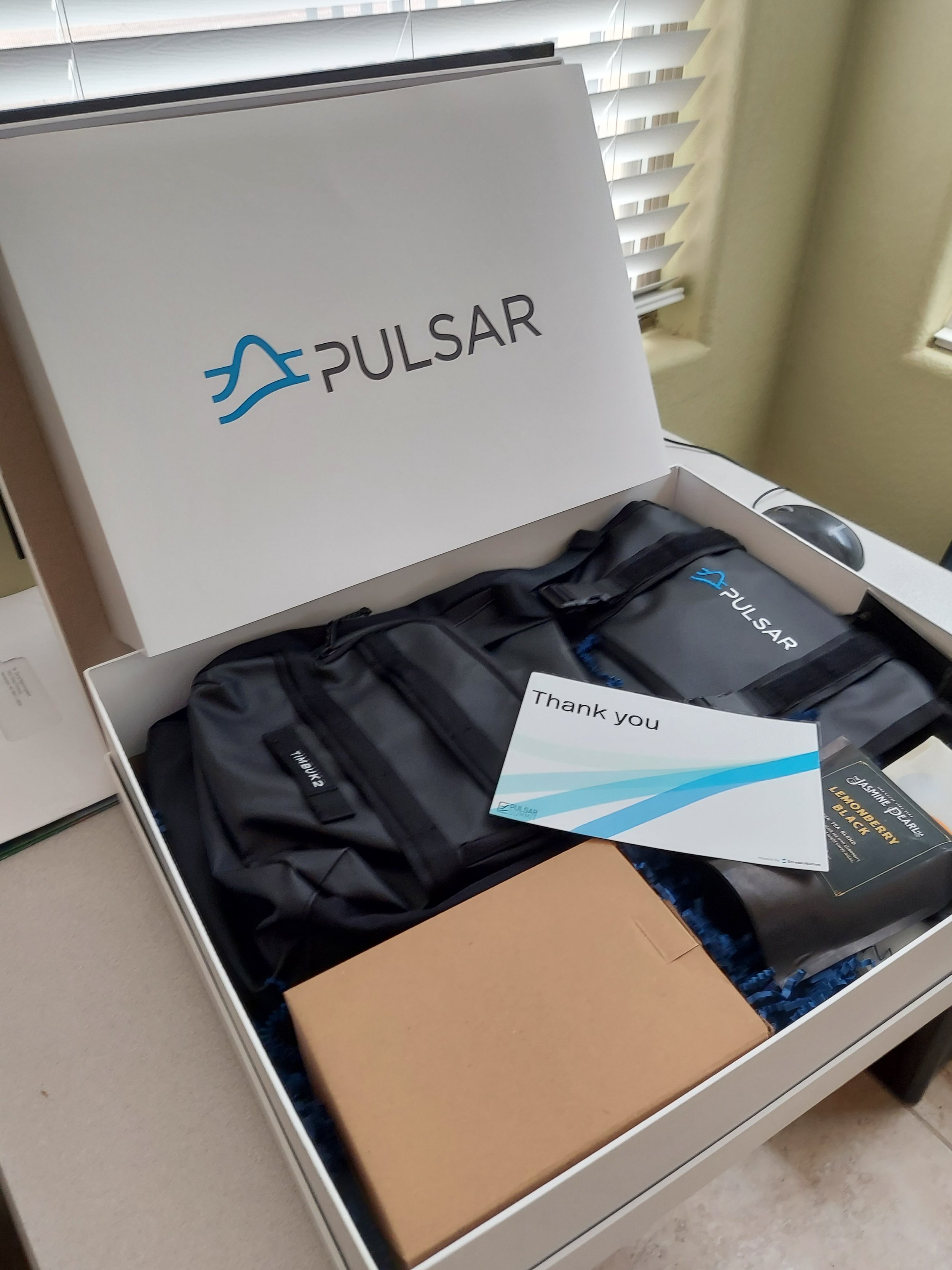
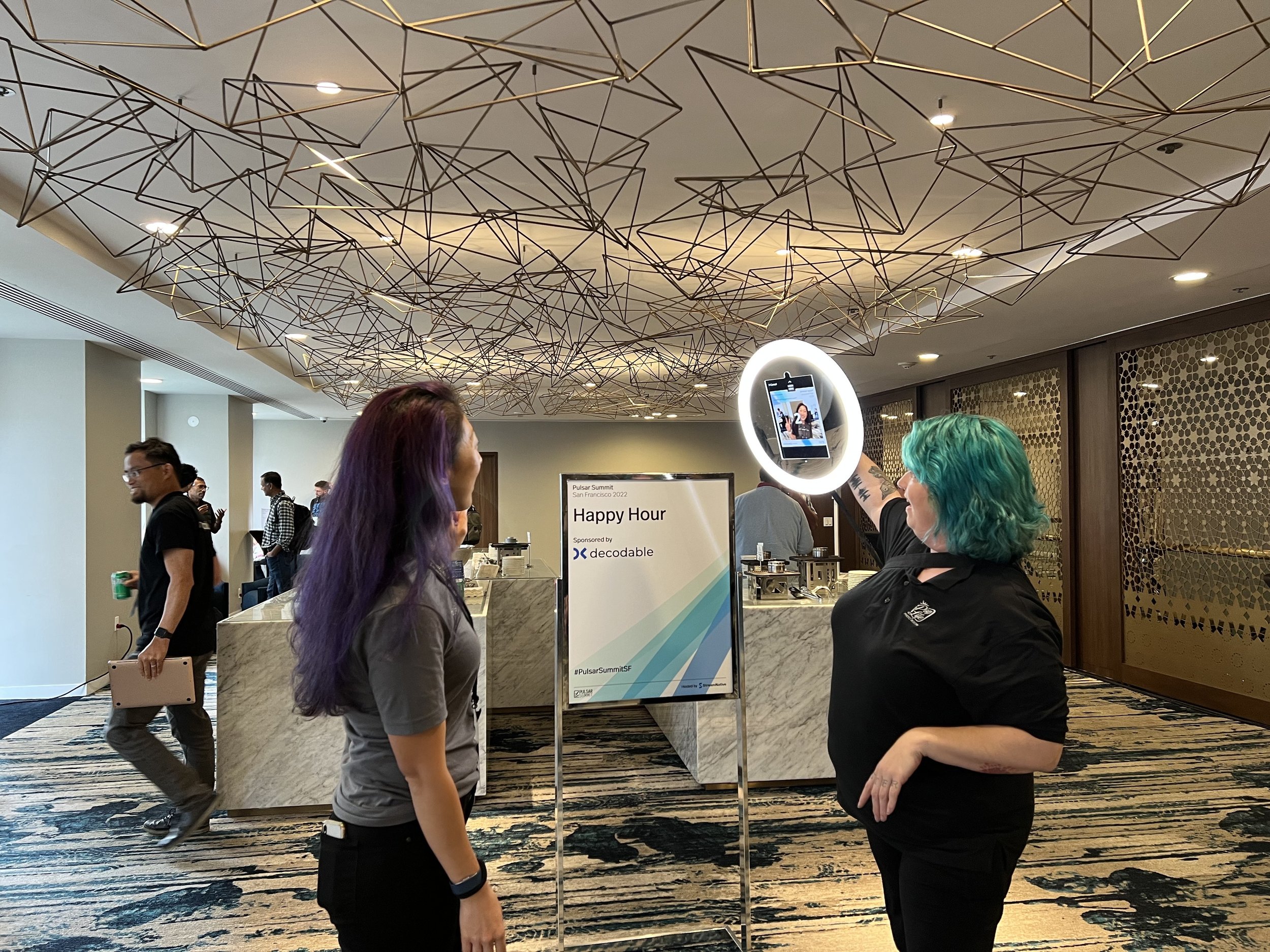
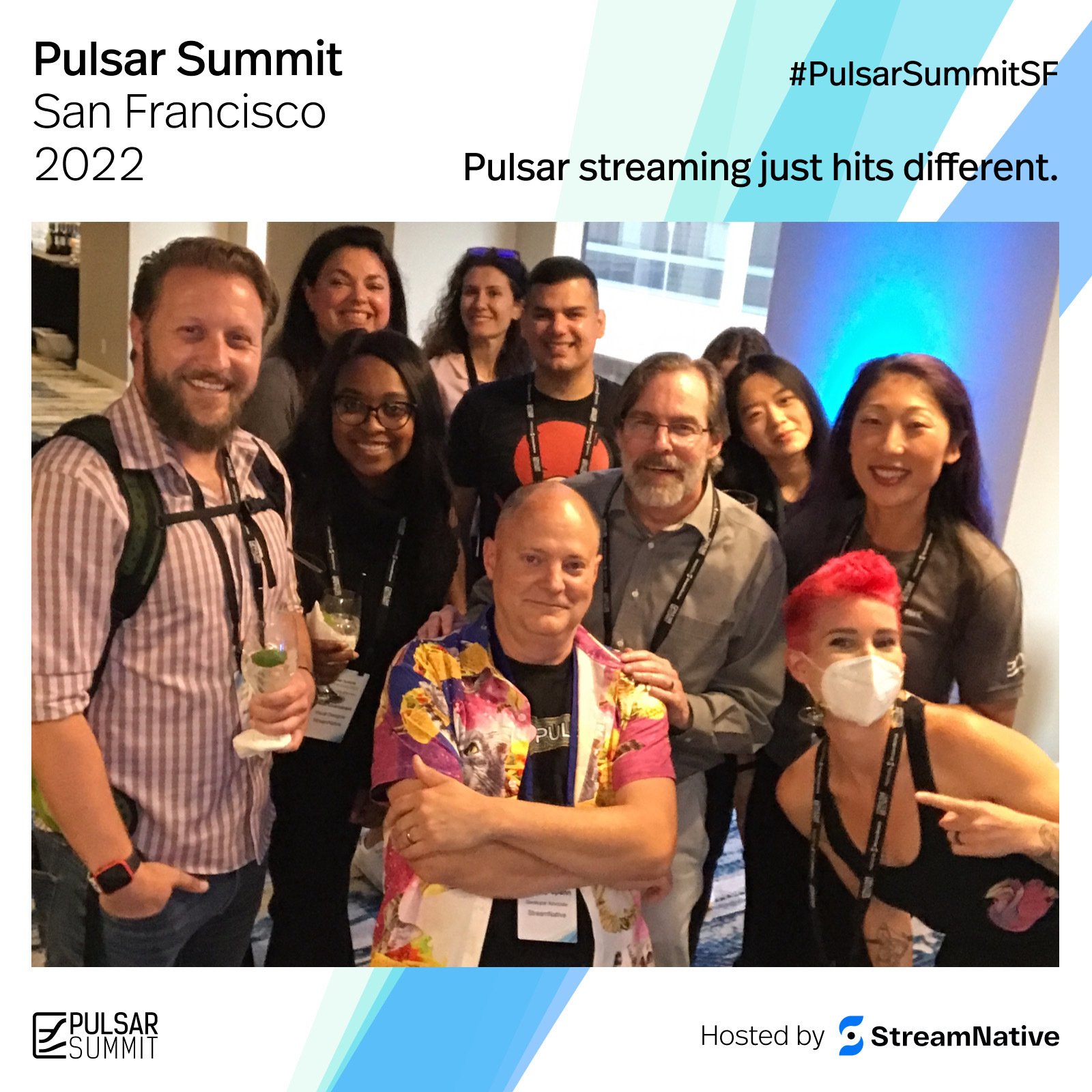
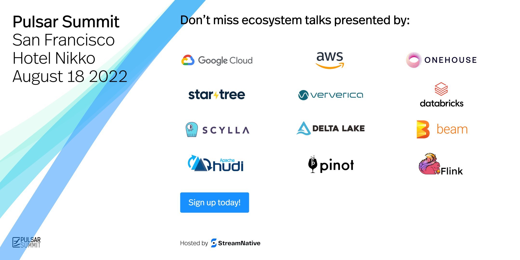
Overview
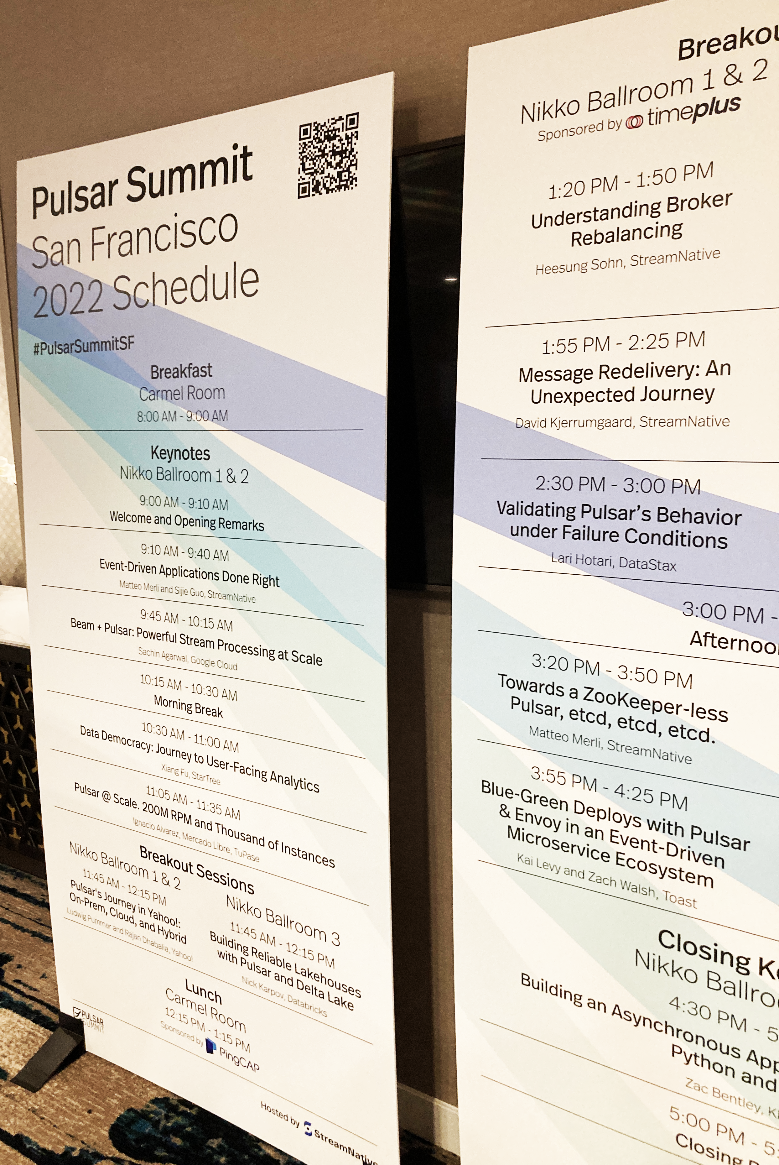
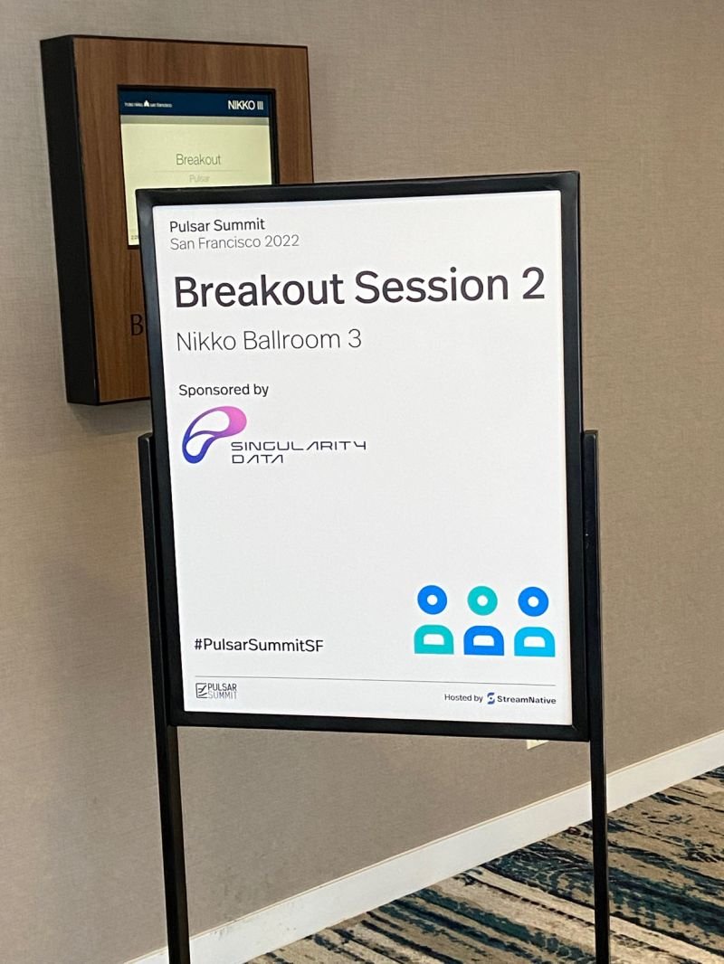
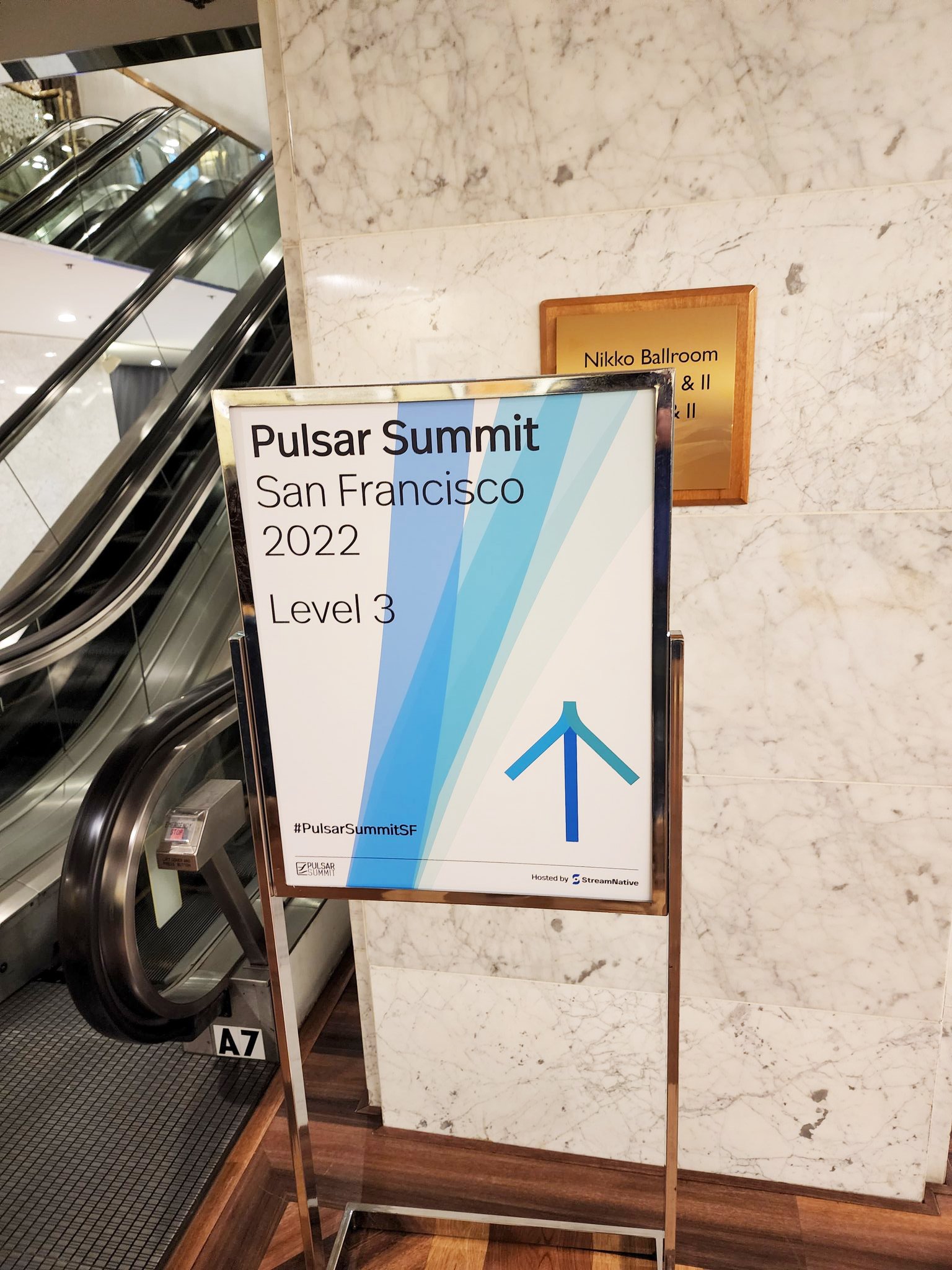
The design team was responsible for creating a wide range of assets for StreamNative’s first in-person summit since the start of the pandemic. The Pulsar Summit took place in August 2022 at Hotel Nikko in San Francisco and featured speakers from leading companies including Google, AWS, Databricks, Onehouse, StarTree, Intel, ScyllaDB, and more.
I collaborated closely with the Senior Visual Designer and the Head of Product Design on a variety of materials, including signage, swag, email banners, social media graphics, name badges, environmental graphics, booth designs, and more.
The visual theme was inspired by pulsar waves, abstracted to create a sense of depth and calm. This was reflected in the use of layered transparencies and a calming palette of blue tones.


The Plan
OVERVIEW
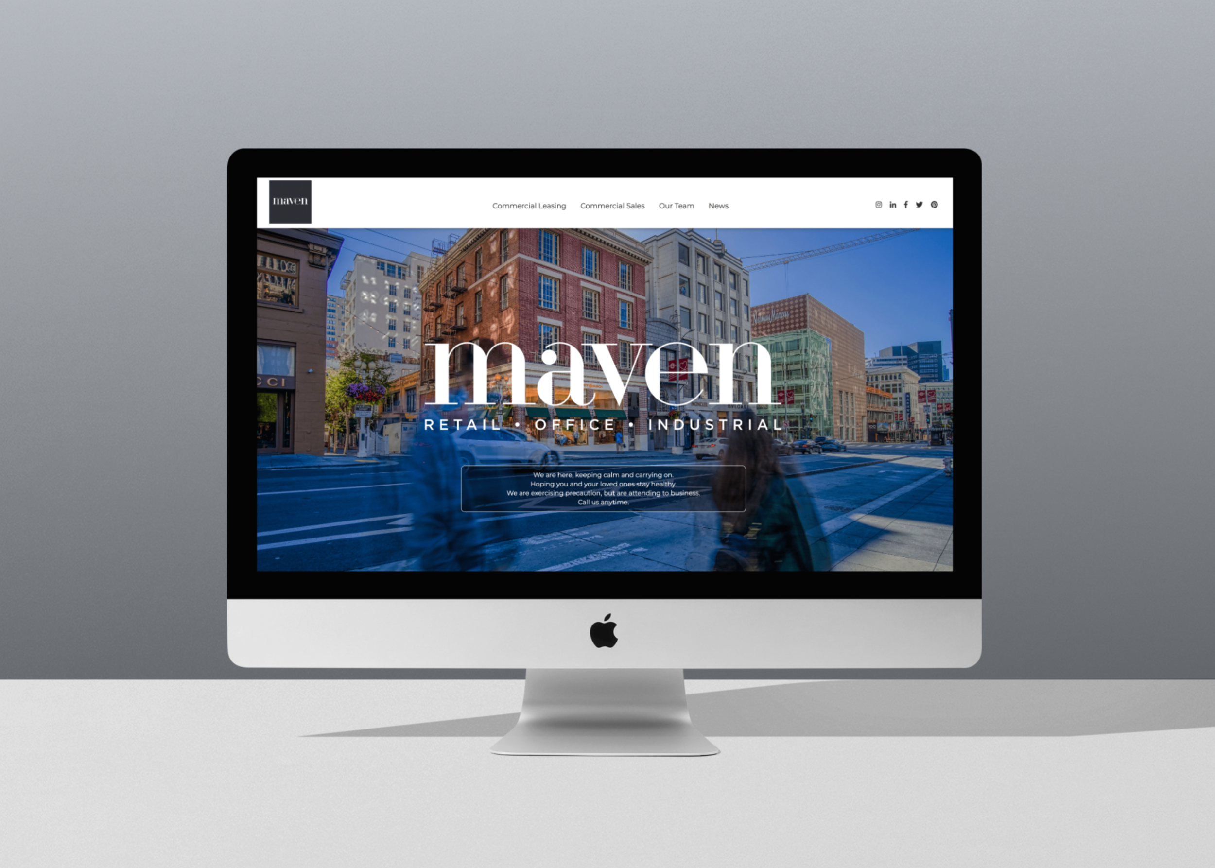
DeRose & Appelbaum (a commercial real estate company in San Francisco) transitioned into Maven Commercial, Inc. and I was in charge of most of the rebranding efforts — including the website. The main goal was to make it easier to find available properties for lease and for sale. The logo was designed by an outside team, but I worked with colleagues to decide on some of the branding guidelines and I created all of the wireframes, and prototypes. The website itself was brought to life by our web developer.
GOAL
The DeRose & Appelbaum website didn’t have strong navigation and searching for properties (for sale and for lease) needed to be improved.
USER BASE
Potential and existing tenants (which include small business owners to large national and international companies), landlords and brokers (inside and outside of the company).
Visit the website (note: there have been updates from a new designer since I left) >

Learning from the Competition
Considering the time constraints for this project, I focused more on competitive research over user research. I checked out a lot, and I mean a lot, of real estate company websites and wanted to see how they presented their properties, how they used maps, what kind of photography they were using, and their search functions among other things. Even though DeRose & Appelbaum (D&A) was a commercial real estate firm, I also looked at some residential firms as well.
Comparing some of these sites content to D&A, I saw that some had really specific search functions which D&A was lacking at the time. That, along with the navigation structure and the readability of content were high priorities based on feedback from the team.
After several rounds of going back and forth with the team we decided what the structure for the website should be and it was very important that we had dropdown navigation.


The navigation is now consistent throughout the site and the text is more readable.


The old footer had a lot of bright orange, which stylistically felt a little dated and made the text harder to read. The new design is more sleek and visitors can also get to a simplified version of the navigation in the footer in addition to the header.

Property Page
One of the main pain points amongst the team was how it was impossible to find a specific type of listing without having to click through all of the links, which was a huge waste of time and contributed to a large amount of drop offs from the site. The amount of content was overwhelming, especially if a visitor didn’t know what they were looking for.
I decided to use the property page as an example because it was consistently one of the most visited pages on the website. The redesign gives visitors the option to search by use, address, neighborhood, and square footage. Additionally, I added neighborhood and square footage information to the property link, which gives visitors the option to scroll and get some more detail about the property.
This made the page much easier to use. In the old structure, visitors were only able to filter properties by what was new and by the square footage. With the square footage option there was no way to see if you were going from largest to smallest or vice versa, so clicking on a few properties was the only way to see that. Also, these options were hidden in a hamburger menu, which is typically reserved for navigation.
Making all of the search functions visible and displaying neighborhood and square footage on each individual property gave the page a less scattered feel.


Findings and Main Takeaways
FINDINGS
Once we launched the website, the results were pretty clear. By focusing on the navigation structure, improving on content structure and the property search feature, the website’s user engagement instantly increased, which is always good news because that has led to more properties going off the market (and more $$$). Maven has grown exponentially since the redesign and the site has been getting more hits over time. I have received a lot of positive feedback and am happy that Maven has a more user-friendly site.
TAKEAWAYS
This was my first website redesign. Being the sole designer, the amount of feedback I received could be very overwhelming at times. Often, my brain was spinning and going in multiple directions. My days were dominated by endless questions and theory crafting.
Sometimes, it was easy to be too focused on how the UI would affect certain elements on the page, and I would I briefly lose sight of things. Generally, I like to please everyone when it comes to my work and wanted to include every feature my co-workers pitched to me but that sometimes ended up being a problem. I learned that I needed to cherry pick and prioritize features better.

I designed a collection of badges that complemented a series of Apache Pulsar training courses for StreamNative Academy. These courses offered the flexibility of accessing on-demand videos and enrolling in self-paced modules. By successfully completing their certification program, people could effectively showcase their in-depth understanding of Pulsar, acquired directly from its original creators.


Overview
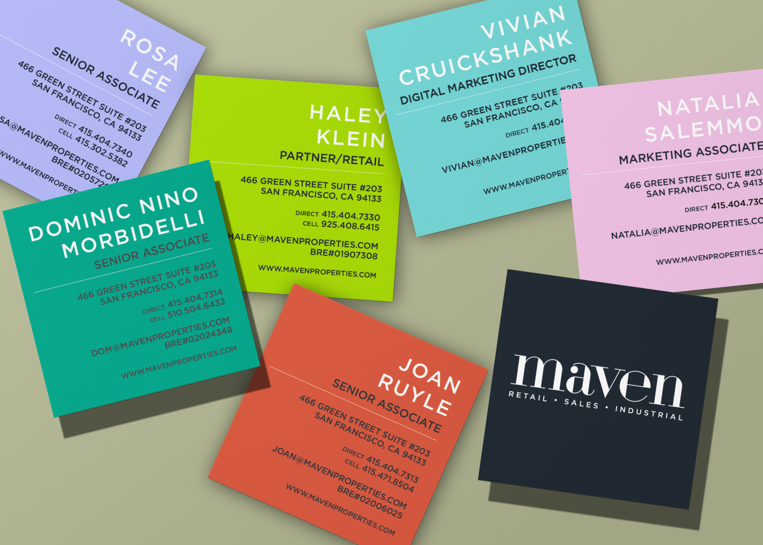
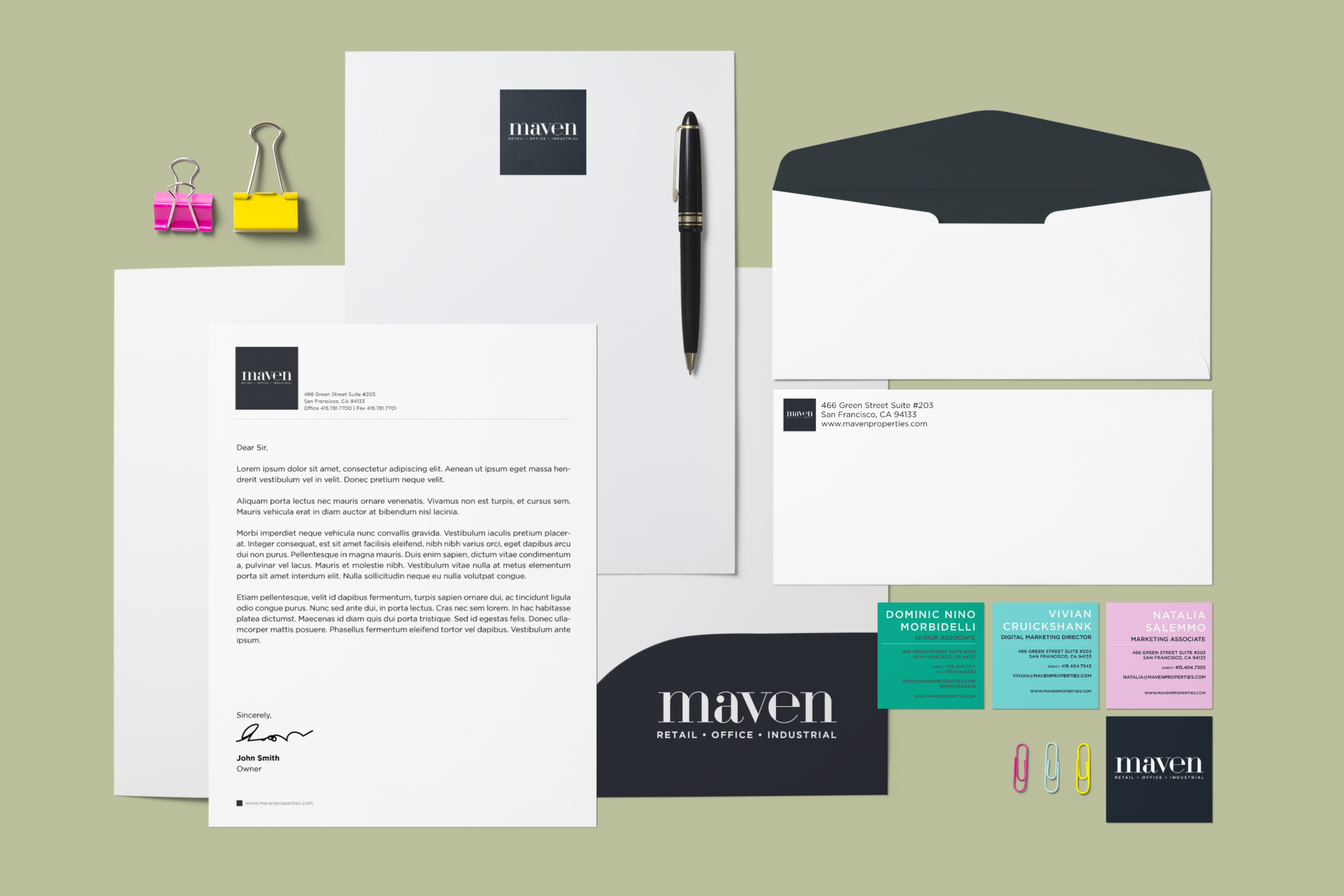
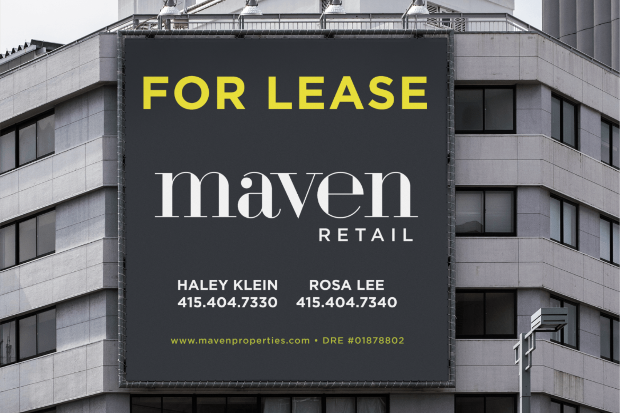
With the rebrand from DeRose and Appelbaum to Maven in 2019 (the logo was designed by an outside firm), my colleagues and I came up with the branding guidelines which features some very vibrant candy-like colors (as seen on the business cards). I also designed a variety of different materials to support the new look. We took inspiration from city we live and work in, San Francisco. We are lucky to be surrounded by murals, nature and some funky colored buildings, so we created a new and more simplified voice for the company.
When people think of commercial real estate, they don’t necessarily think of it being bold, fun and youthful. Maven is a young company, yet is leading the way for what commercial real estate will look like. The goal was to provide a stronger foundation to move into the future.
The result is a bold yet sleek gesture that can be deployed both as a stand-alone mark and can also be reinterpreted through a variety of combinations.

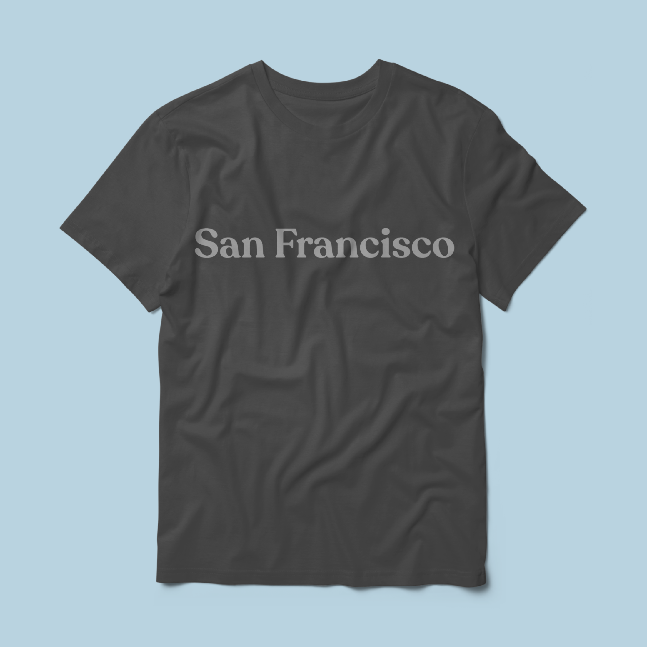
Overview
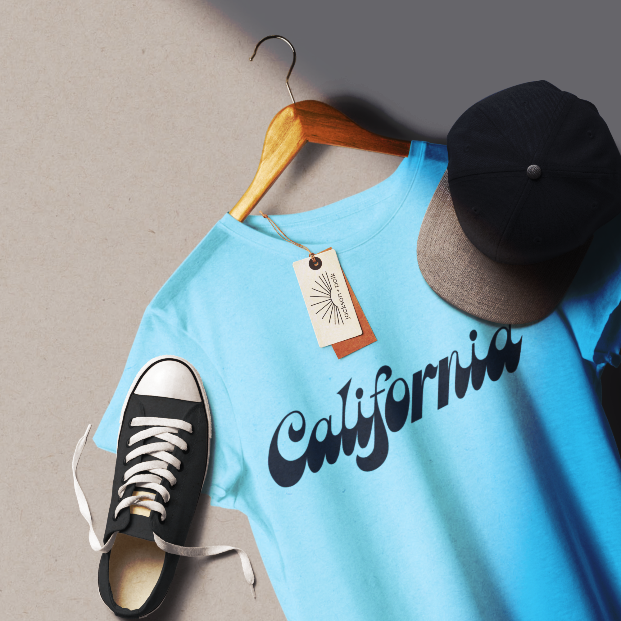
I created a line of graphic t-shirts with a Bay Area/California theme for San Francisco based boutique, Jackson + Polk. I worked with the owner and store manager to come up with some iconic imagery that we could represent on these t-shirts and came up with some sport, and text based ones. These were exclusive to the store.

Mood Board
This collection was inspired by 1970s California, the vibrant energy, bold scenery, and spirited people of that era. The '70s were iconic for their standout graphic tees, which became the spark behind this line.


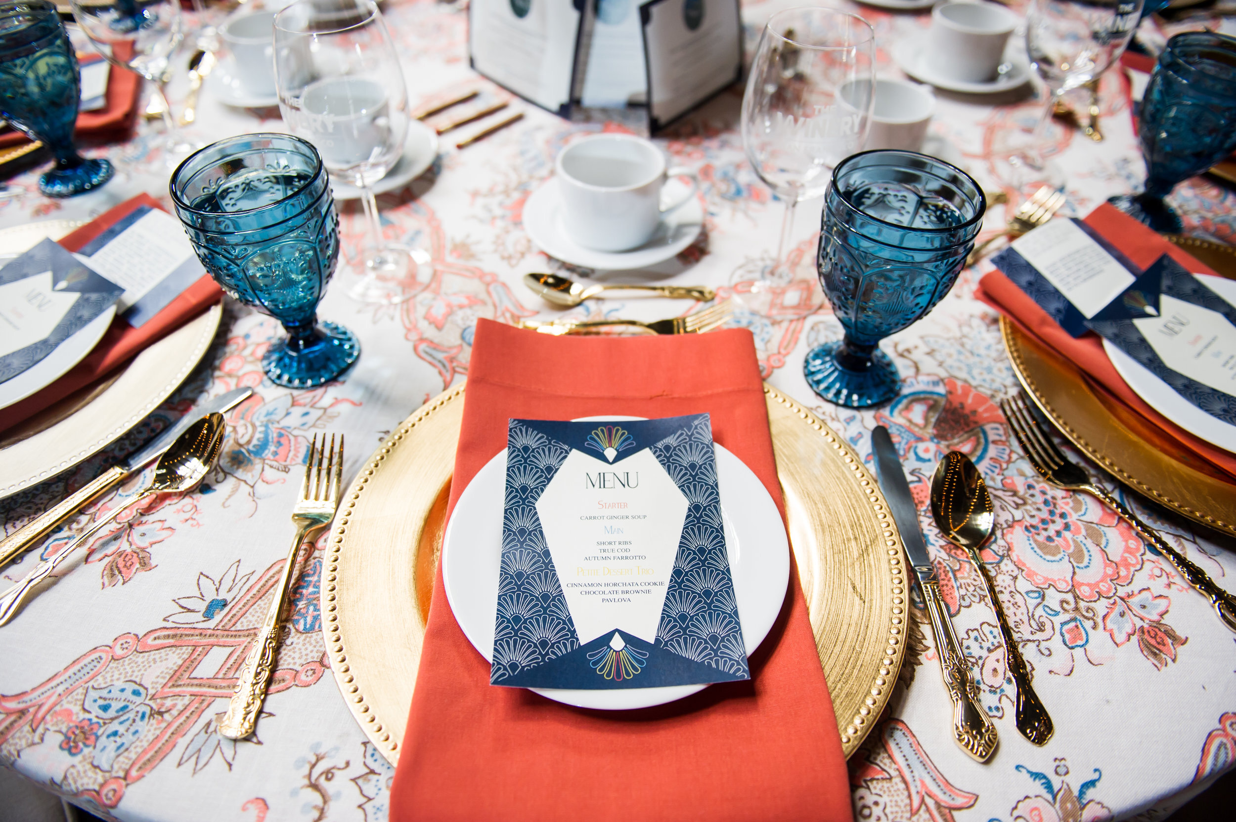
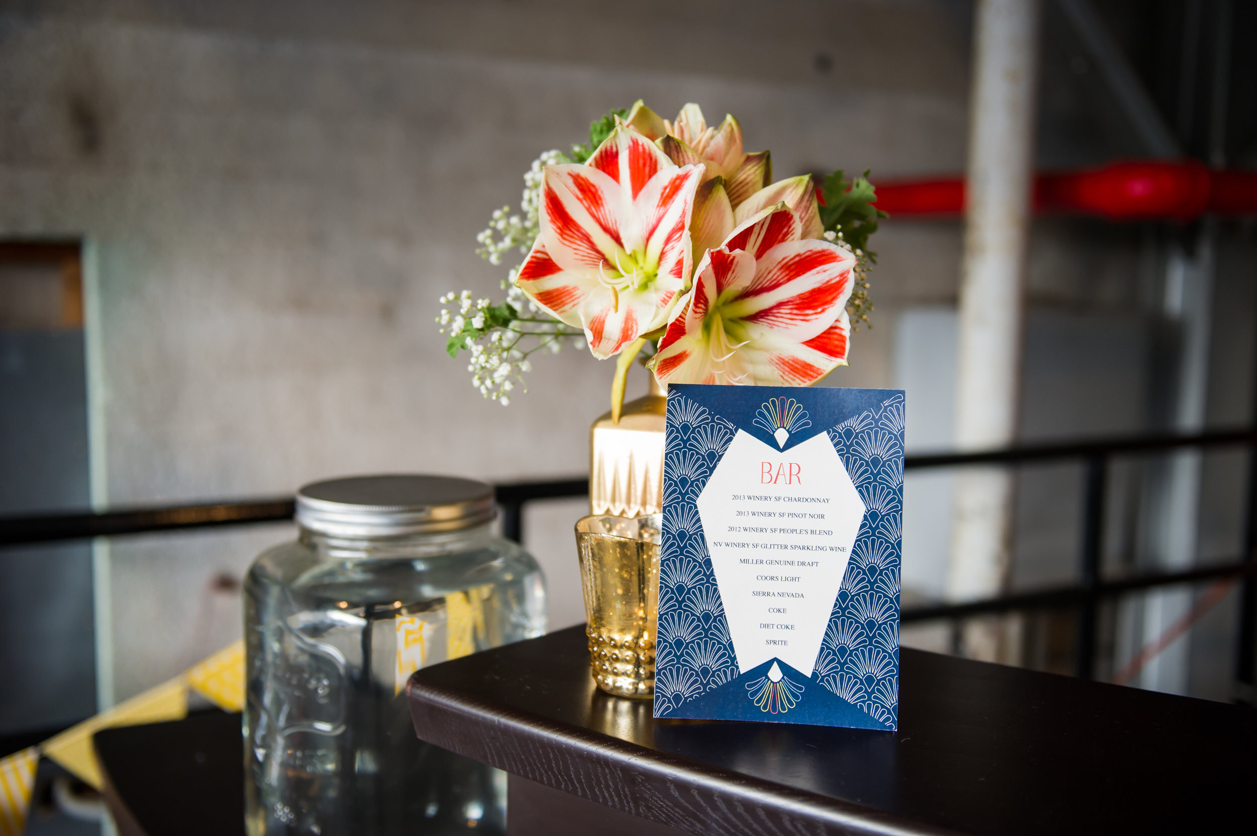
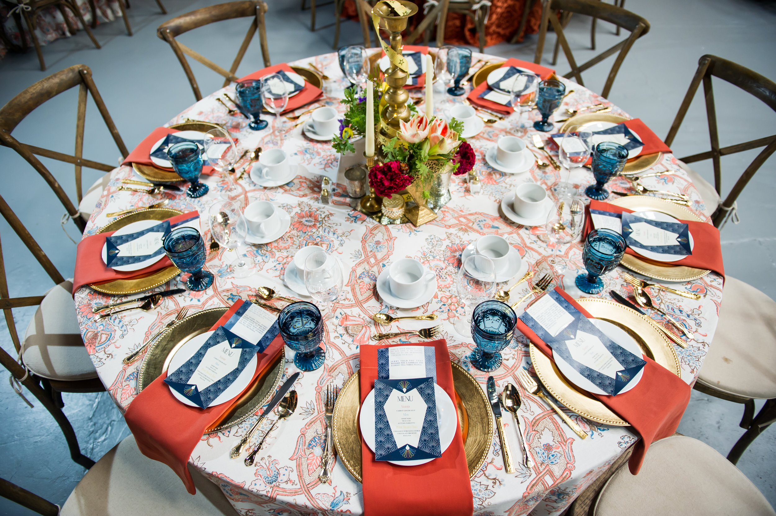
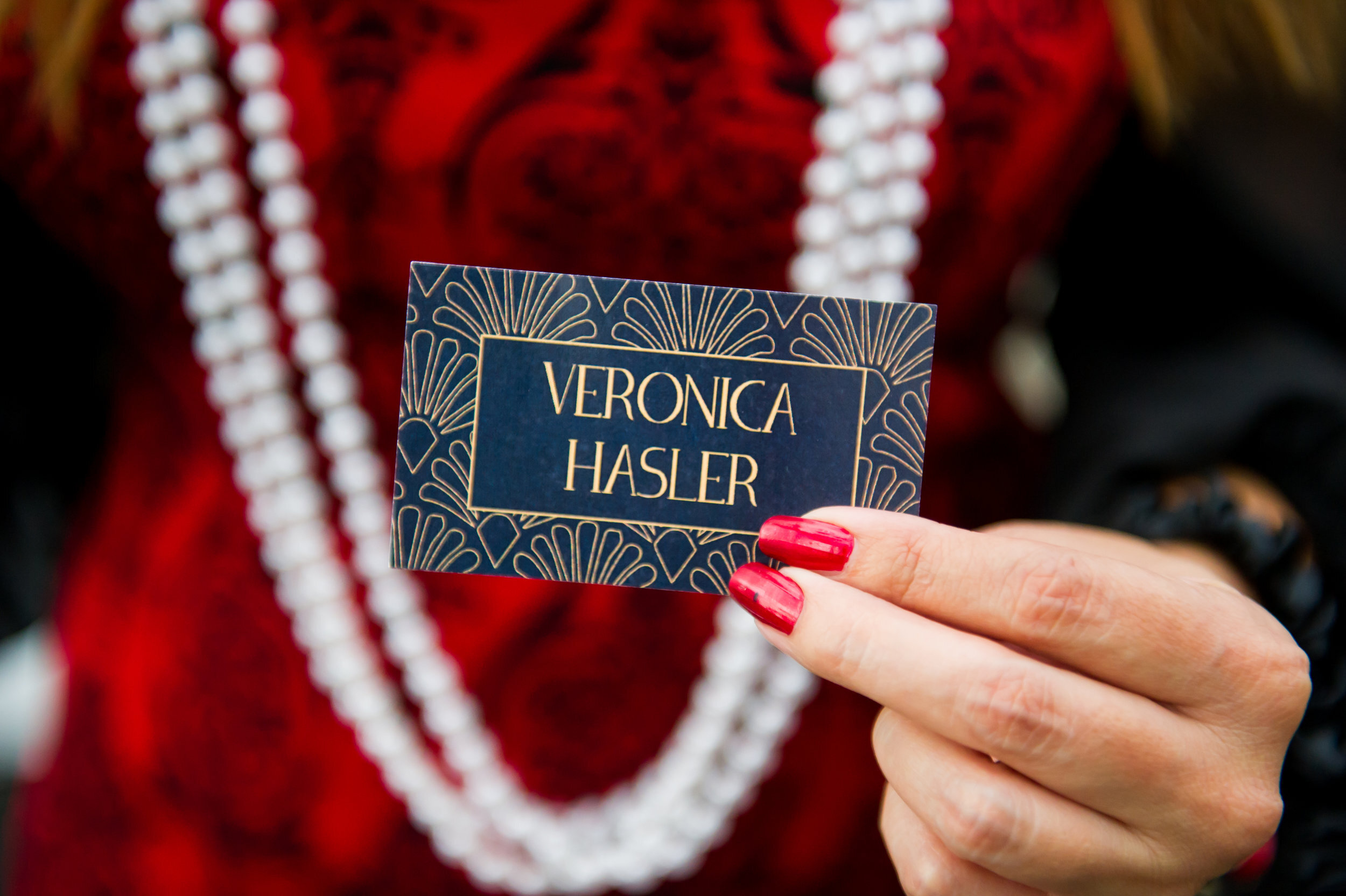
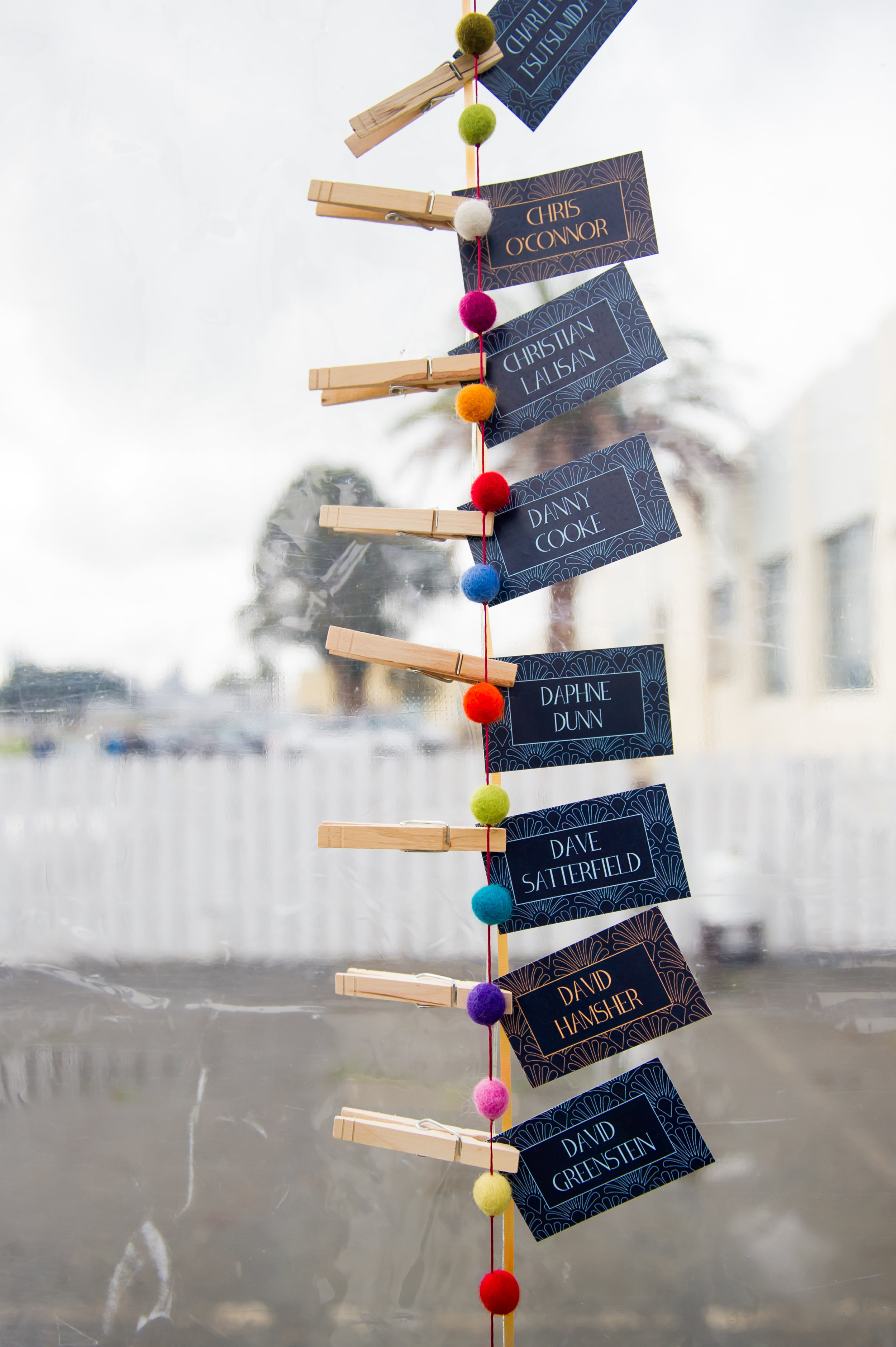
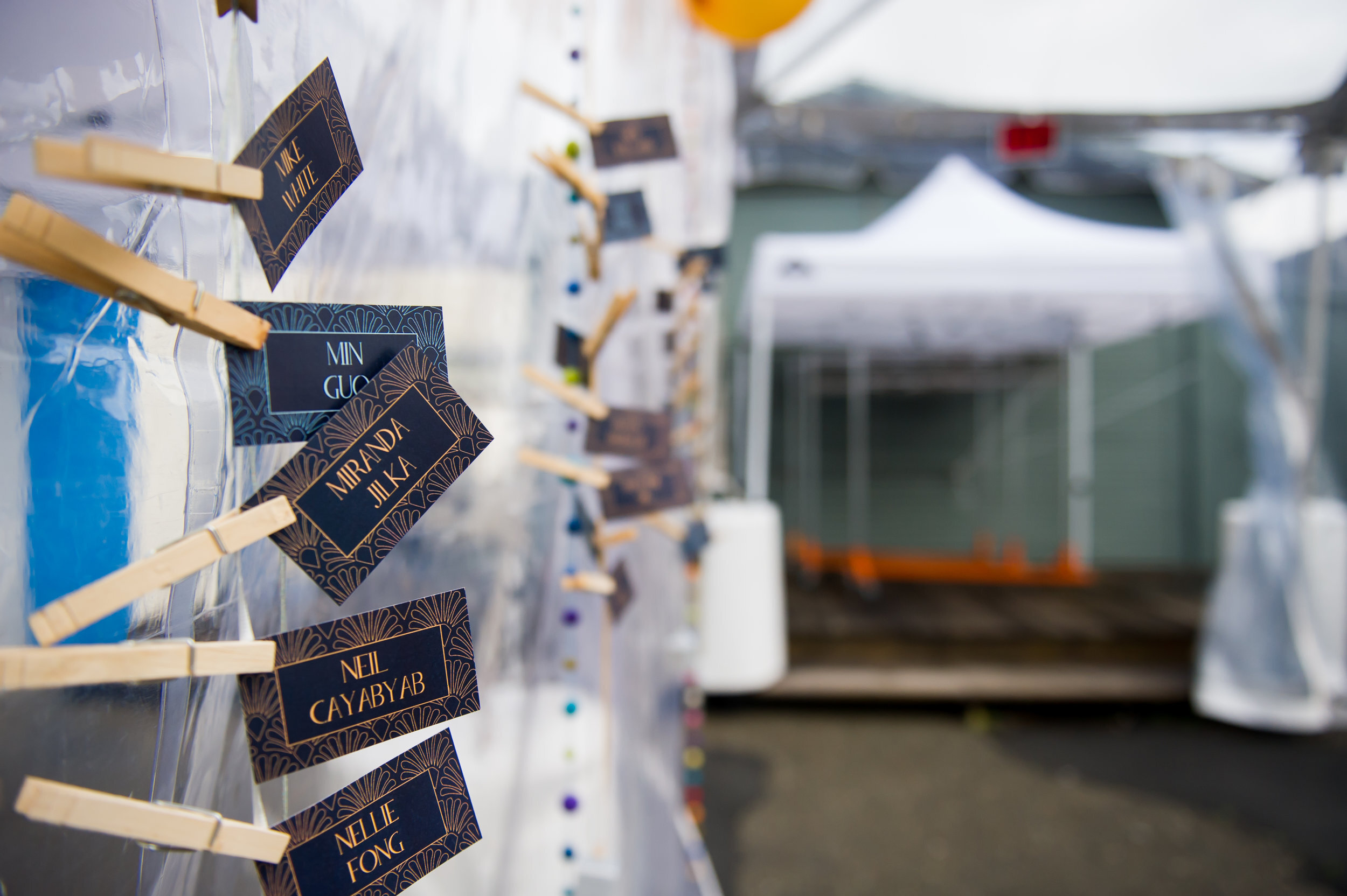
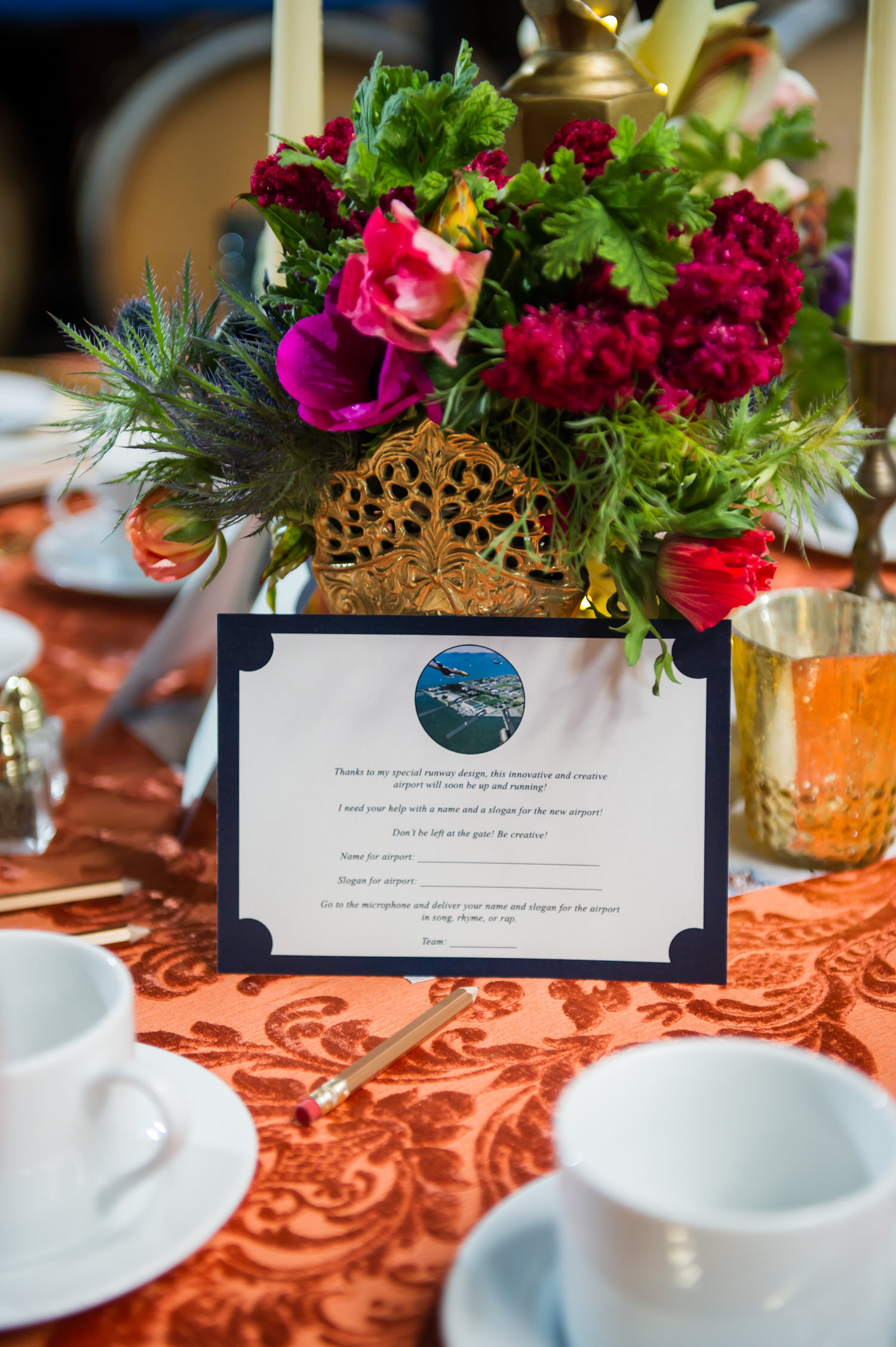
Overview
I created invitations, menu/drink cards, name table cards and game cards for the FivePoint Holiday party on Treasure Island. It was 1930s themed so I went with an art deco look. I also created the illustrations.
Photography by Chloe Jackman