Maven Rebrand
〰️
Maven Rebrand 〰️
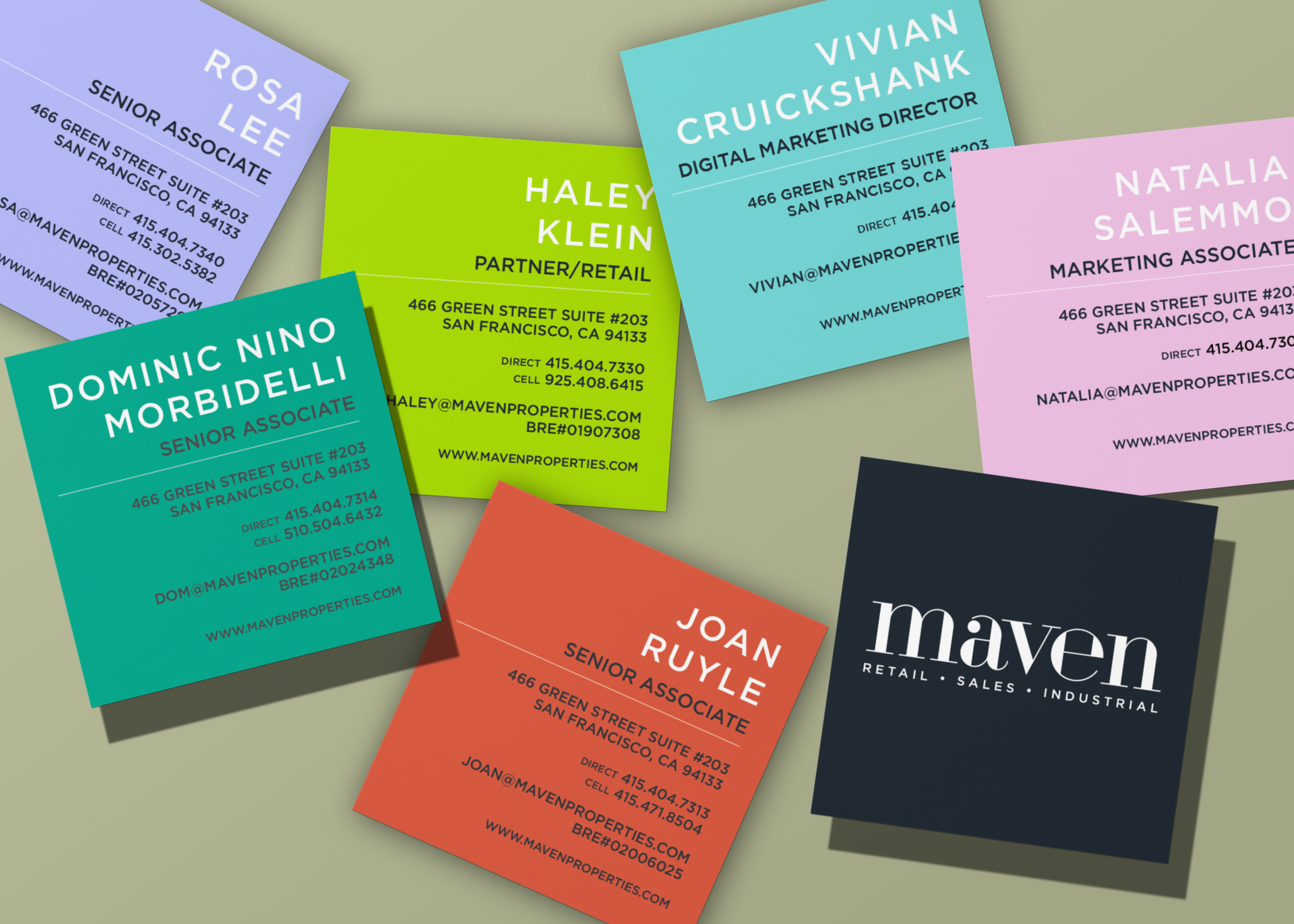
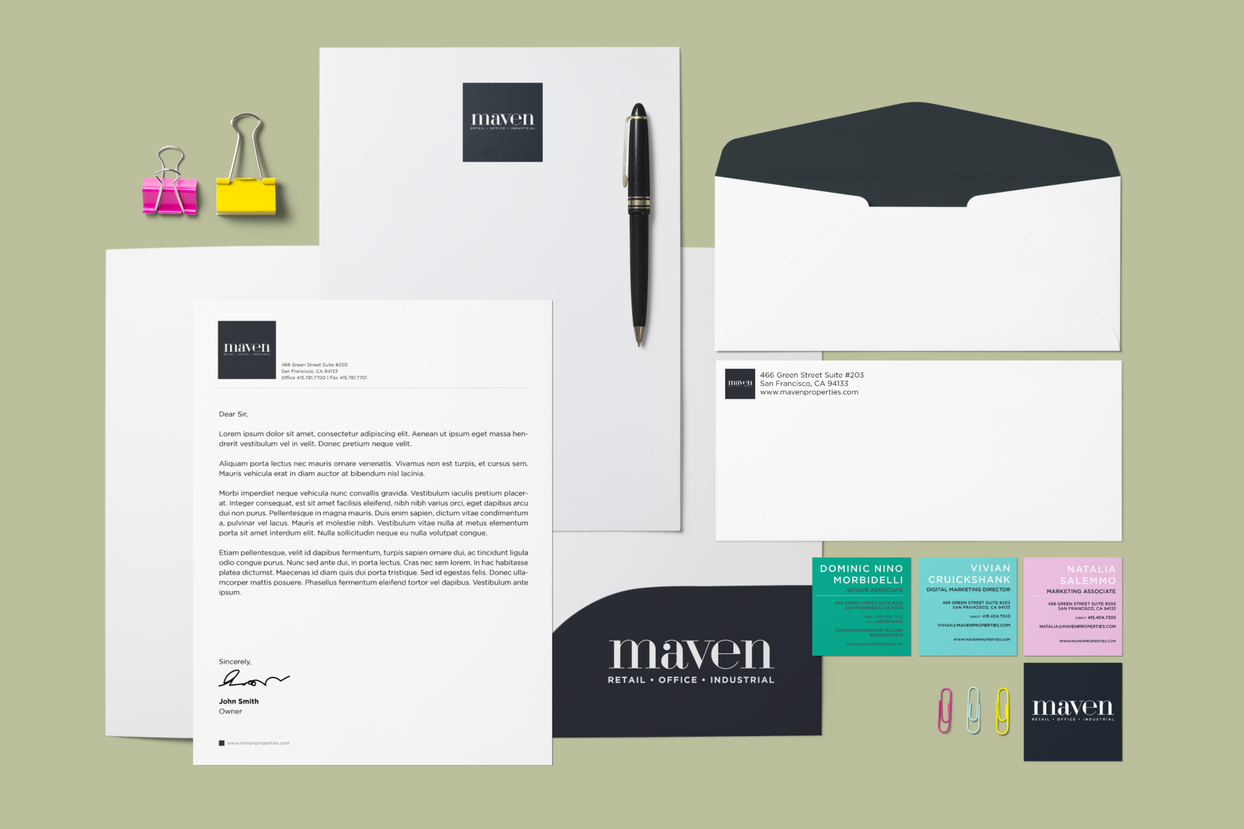
With the rebrand from DeRose and Appelbaum to Maven in 2019 (the logo was designed by an outside firm), my colleagues and I came up with the branding guidelines which features some very vibrant candy-like colors (as seen on the business cards). I also designed a variety of different materials to support the new look.
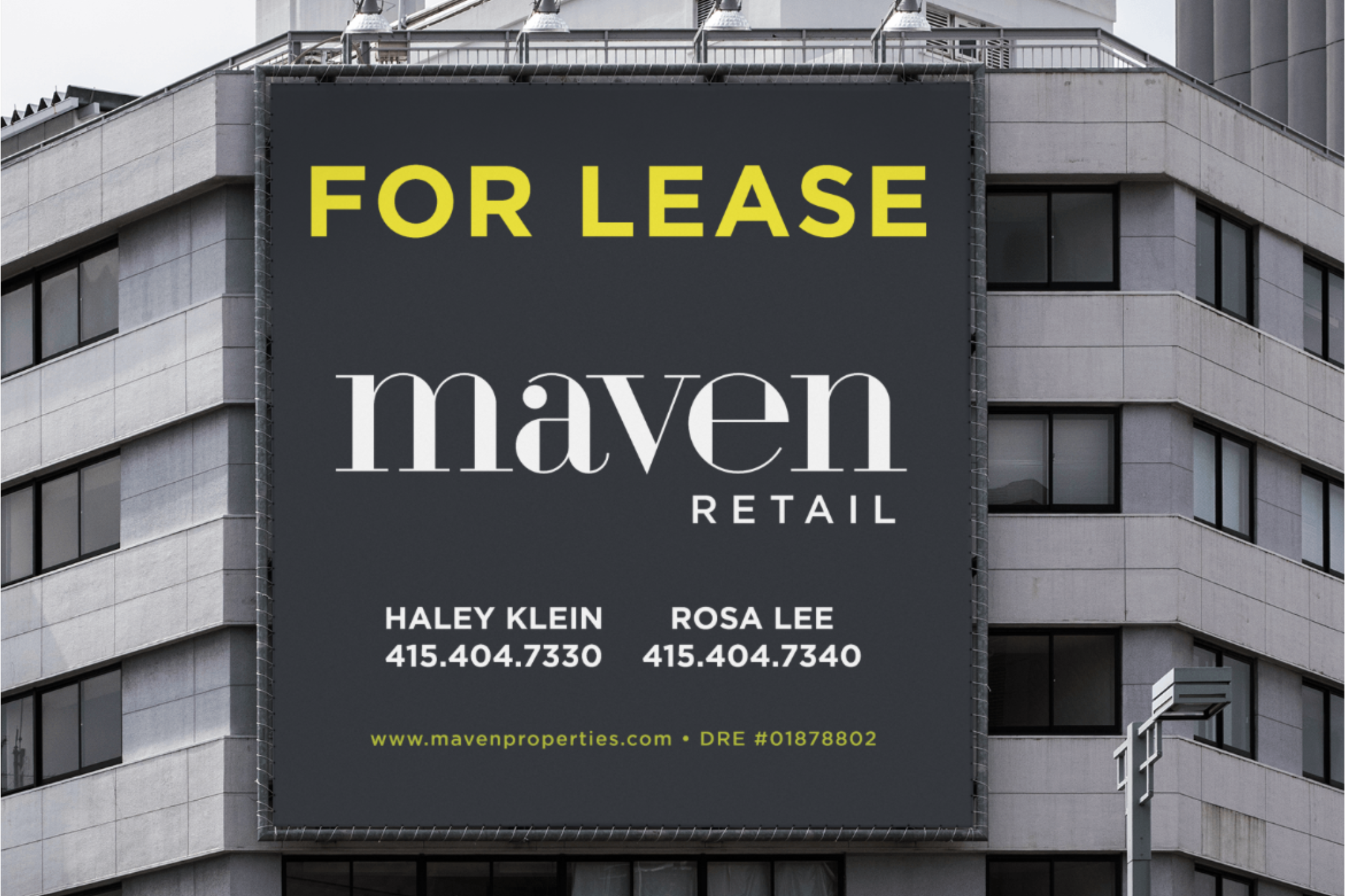
When people think of commercial real estate, they don’t necessarily think of it being bold, fun and youthful. Maven is a young company, yet is leading the way for what commercial real estate will look like. The goal was to provide a stronger foundation to move into the future.
The result is a bold yet sleek gesture that can be deployed both as a stand-alone mark and can also be reinterpreted through a variety of combinations.
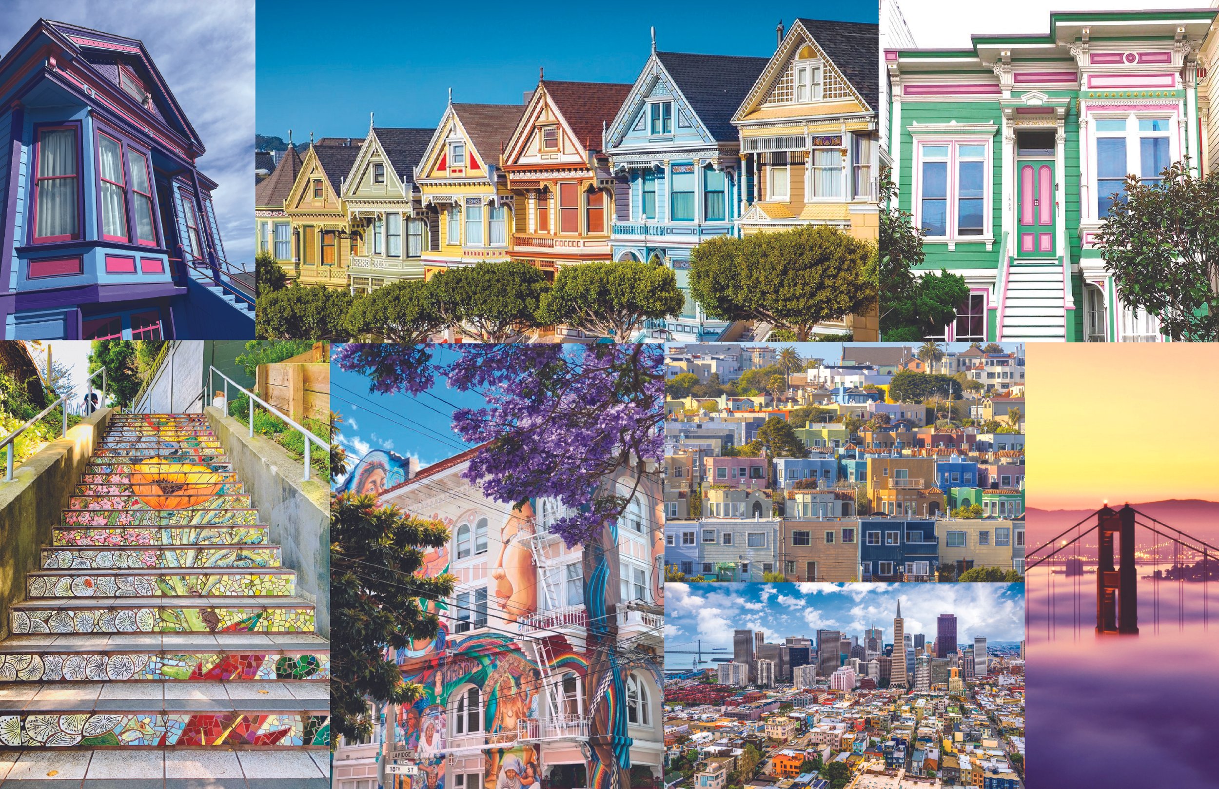
I drew inspiration from the vibrant character of San Francisco, the city where the company is based. Influenced by its colorful murals, unique architecture, and natural beauty, I developed a refreshed and more streamlined visual voice that reflects the city's creativity and spirit.
Square business cards felt like a natural choice, echoing the shape of the logo. To add a personal touch, each employee selected their preferred color, making the cards both cohesive and customizable.